Monday, March 19, 2012
Thursday, March 15, 2012
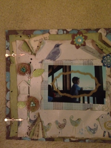
VARIOUS PAGES
Monday, March 12, 2012
I want a ride on"The Little Yellow Bicycle"
Tuesday, March 6, 2012
Threading it
I painted my thread holder, added a ribbon and hung it on the wall so my thread is easily accessible....
Monday, February 27, 2012
Newest creation
My lastest creation Irish placemats. Fell in live with this pattern and 12 placemats later ( still love it).....
Sunday, February 26, 2012
Graphic 45 Design Team 2012 Audition
This layout was created to look like you were looking into a window. I thought the paper with the houses went perfectly. There are many pop dots to create dimension.


This vintage layout was distressed by filing and inking the paper edges. I also created a looping pattern in the paper patterned ruler.


This layout was created using a page from a very old book,it is folded and hidden behind a torn spot on the layout. I then flicked it with paint to distress. This look is perfect for the paper choice of the layout.


On this layout I flicked paint as another way of distressing the layout and poped out a lot of the paper pattern to create dimension.


This layout has many different torn and inked paper in various sizes and shapes with a vintage frame to offset them.


On this layout I used various prima flowers in a bunch and I used ribbon to tie the cardstock and title together .


This layout was special because I found a frame what went perfect with the vintage look of the layout. It also emphasised the paper and flower choices.


This layout required alot of cutouts and pop dots to created a three dimensional look.


Thank you for your consideration. It would be a dream come true to be one of your designers.


This vintage layout was distressed by filing and inking the paper edges. I also created a looping pattern in the paper patterned ruler.


This layout was created using a page from a very old book,it is folded and hidden behind a torn spot on the layout. I then flicked it with paint to distress. This look is perfect for the paper choice of the layout.


On this layout I flicked paint as another way of distressing the layout and poped out a lot of the paper pattern to create dimension.


This layout has many different torn and inked paper in various sizes and shapes with a vintage frame to offset them.


On this layout I used various prima flowers in a bunch and I used ribbon to tie the cardstock and title together .


This layout was special because I found a frame what went perfect with the vintage look of the layout. It also emphasised the paper and flower choices.


This layout required alot of cutouts and pop dots to created a three dimensional look.


Thank you for your consideration. It would be a dream come true to be one of your designers.
Subscribe to:
Posts (Atom)


